B.3 Formatting with the pubtheme package
We can use the pubtheme package to change the default formatting of our figures. We can copy and paste templates here https://github.com/bmacGTPM/pubtheme and modify them for our data. Here we copy and paste the scatter plot template and change x to ascore, y to hscore, and edit the axis limits and the breaks, which say where the grid line should be. Don’t worry to much about understand all of these options right now, we’ll discuss those in the main text.
Code
library(pubtheme)

title = "Home Team Points vs Away Team Points"

g = ggplot(d, aes(x = ascore,
                  y = hscore,
                  color = season.type))+
  geom_point()+
  labs(title = title,
       x = 'Away Team Points',
       y = 'Home Team Points')+
  scale_x_continuous(limits = c(65, 165), breaks = c(65,115,165), oob = squish, labels = comma)+
  scale_y_continuous(limits = c(65, 165), breaks = c(65,115,165), oob = squish, labels = comma)+
  coord_cartesian(clip = 'off', expand = FALSE)+
  scale_size(range = c(2,6))+
  theme_pub()
print(g)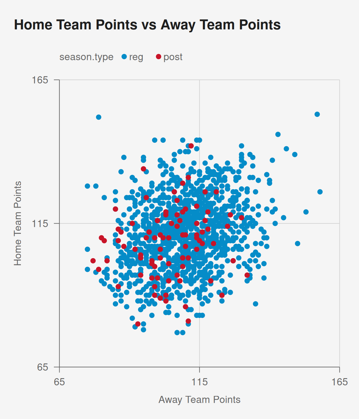
We explicitly specified the scales and coord_cartesian above. If you are comfortable accepting the pubtheme default settings, you can save a lot of typing by using the function pub, which applies theme_pub and also automatically adds scales and coord similar to above.
If you are comfortable accepting the pubtheme default settings, the pub function can eliminate the need to use the lines with scale_x_continuous, scale_y_continuous, coord_cartesian, scale_size, theme_pub, resulting in much more succinct code.
Code
[1] 57.35768
[1] 80
[1] 20
[1] 157.3577